Results 1 to 9 of 9

Thread: In the Woods repost

  1. #1
    BPN Member Christopher Miller's Avatar
    Join Date
    Jan 2009
    Location
    Massachusetts
    Posts
    5,677
    Threads
    586
    Thank You Posts

    Default In the Woods repost


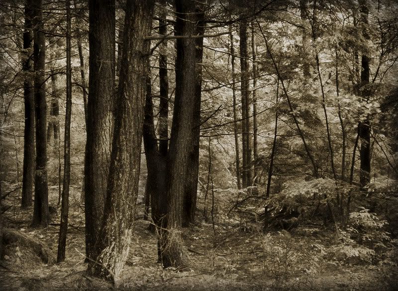
    Roman, I thought you said you were going to have a go at this for me. Guess you forgot? ;) Anyway, I tried myself using the dodge and burn tool as you suggested. Is this good or does it still need more tweaking?

    Anybody else looking, feel free to chime in too! For those who missed my original post, here's the link to it.

  2. #2
    Roman Kurywczak
    Guest

    Default

    Attached Images Attached Images
     
    Hey Christopher,
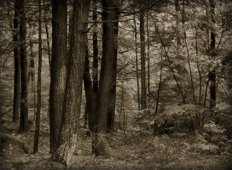
    sorry....in the middle of doing my bathrooom renovation. I went a little heavy handed...as i like infrared so the white may not be to everyones liking...mostly using the lasso tool in small areas and doing levels layer adjustments.....then dodged and burned varying the opacity. Yours has a softer feel....which I like....mine is a bit more bold, so you may not want to go in that direction but this will give you a few ideas you may want to try. let me know what you think.
    PS had to save at 56 quality

  3. #3
    BPN Member Christopher Miller's Avatar
    Join Date
    Jan 2009
    Location
    Massachusetts
    Posts
    5,677
    Threads
    586
    Thank You Posts

    Default

    Thanks Roman! I was sure you had a good reason :). Personally I prefer the softer feel of my image, but do like what you did too. I think I'll probably play with this some more, maybe try something more in between your take and mine. Would like to hear other people's opinions on this too.

  4. #4
    Roman Kurywczak
    Guest

    Default

    Hey Christopher,
    Stay away from any contrast boost then or adding blacks in selective color. That is the biggest difference in the softness area. The levels layers and burning will be OK and not as strong. Hope others chime in too.

  5. #5
    Robert Amoruso
    Guest

    Default

    I like Roman's contrast boost but would hold back on the blacks.

  6. #6
    BPN Member Christopher Miller's Avatar
    Join Date
    Jan 2009
    Location
    Massachusetts
    Posts
    5,677
    Threads
    586
    Thank You Posts

    Default


    Thanks for the advice. Here's my latest try on this with some more curves adjustments and more dodging and burning. Let me know what you think.

  7. #7
    Robert Amoruso
    Guest

    Default

    Chris,

    I like what you did with this and where I think you needed to go. Good job.

  8. #8
    Roman Kurywczak
    Guest

    Default

    Hey Christopher,
    final one kept the softness yet brought out the layers nicely. Nice job.

  9. #9
    BPN Member Christopher Miller's Avatar
    Join Date
    Jan 2009
    Location
    Massachusetts
    Posts
    5,677
    Threads
    586
    Thank You Posts

    Default

    Thanks a bunch Robert and Roman! Couldn't have done it without your help.

Posting Permissions

  • You may not post new threads
  • You may not post replies
  • You may not post attachments
  • You may not edit your posts
  •  
Web Analytics