Results 1 to 27 of 27

Thread: Show me what you got!!!!!!

  1. #1
    Forum Participant
    Join Date
    Apr 2008
    Location
    New Jersey
    Posts
    23,119
    Threads
    1,523
    Thank You Posts
    Blog Entries
    55

    Default Show me what you got!!!!!!

    Attached Images Attached Images
     
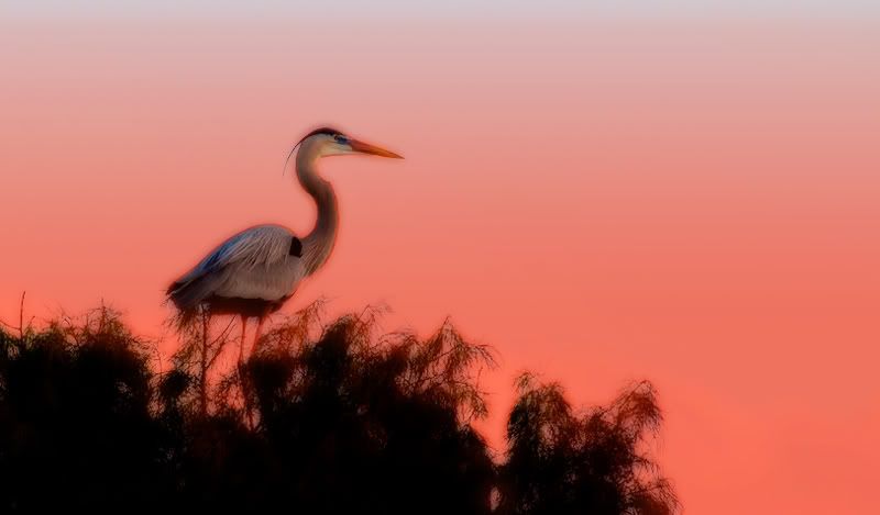
    I challenge everyone on BPN to step out of the box,attached you will see a photo straight out of camera w/ no tweaks- I would like to see your creative juices!!! Show me what you would or could do using any and all PP techniques!! Remember this is OOTB so anything goes(well almost!) So be creative ,be wild, let me see what funky stuff you can come up with !!! I thought it fitting to do a bird ,since this is a bird network!!!:p
    DON'T BE SHY!!!!

  2. #2
    Forum Participant
    Join Date
    Jan 2008
    Location
    Toronto, Canada
    Posts
    8,458
    Threads
    682
    Thank You Posts

    Default

    Attached Images Attached Images
     
    Hi Denise, this was crying out B and W to me.
    First I used content aware and brought the bird over to the left.
    Then I went into Silver Efex and used the Full Spectrum filter.
    Then I went to CS4 Stylize, Find Edges, at 20 percent opacity.
    Then I added a thin black border. Quick and Easy!
    Last edited by Jackie Schuknecht; 02-08-2009 at 07:01 PM.

  3. #3
    Forum Participant
    Join Date
    Apr 2008
    Location
    New Jersey
    Posts
    23,119
    Threads
    1,523
    Thank You Posts
    Blog Entries
    55

    Default

    Jackie, I was hoping someone would do a B&W! Well done and great use of the tools! I like how you put a border on it!

  4. #4
    Gus Cobos
    Guest

    Default "Red Dawn" Repost

    Attached Images Attached Images
     
    Hi Lady Denise,
    I like your way of thinking...:D This is my rendition of Wako...It's titled "Red Dawn" from the HEART...:):cool:

  5. #5
    Forum Participant
    Join Date
    Apr 2008
    Location
    New Jersey
    Posts
    23,119
    Threads
    1,523
    Thank You Posts
    Blog Entries
    55

    Default

    Gus, Isn't red your favorite color!! Red Dawn is a fitting title! I like the texture you put on the BG! very neat!!

  6. #6
    BPN Viewer
    Join Date
    Aug 2010
    Location
    New Jersey
    Posts
    6,829
    Threads
    569
    Thank You Posts

    Default Foolin around

    Attached Images Attached Images
     
    Had a little fun with this...

  7. #7
    Forum Participant
    Join Date
    Jan 2008
    Location
    Toronto, Canada
    Posts
    8,458
    Threads
    682
    Thank You Posts

    Default

    I think you should say how it is done so we all can learn!!!!!

  8. #8
    BPN Viewer
    Join Date
    Aug 2010
    Location
    New Jersey
    Posts
    6,829
    Threads
    569
    Thank You Posts

    Default

    Well Jackie...Here goes..Desaturated image, cropped, went to sketch/graphic pen and finally added a bit of contrast to darken outlines...played with a bunch of things until I got to that.

  9. #9
    Forum Participant
    Join Date
    Apr 2008
    Location
    New Jersey
    Posts
    23,119
    Threads
    1,523
    Thank You Posts
    Blog Entries
    55

    Default

    Dave, I like the crop you chose, very nice use of the sketch tools,the texture in BG adds alot ! Mostly I'm glad you had fun!!! That's what this forum is for-trying new things and having fun doing it! Thanks for sharing Dave.

  10. #10
    Alfred Forns
    Guest

    Default

    Hi Denise ...... can I play too :)

  11. #11
    Alfred Forns
    Guest

    Default

    Attached Images Attached Images
     
    ... couldn't wait till I had permission :) too much fun :cool:


    .... like Denise put it ... this is OOTB material, trying to save it would not do well :)

    Started with some wild options but in the process changed gears and went a different way. Hope I'm not forgetting steps !!!

    First I used levels to set my white point, dragging the right slider while holding he option key (alt on PC) moved until there was some whites showing. Then dragged the middle slider to the left some for lightening the mid tones.

    Then went after the head area with quick mask to lighten and bring some color detail.

    Selected the dark area (tree) using select > color range > then place the dropper on the dark area you want to select, works well for this one. Then to to image> adjust>color balance and paly with the colors to bring whatever is there which is not much, then exaggerate some. After this adjustment I cropped the image. Waited to see what color I could bring to the tree.

    For the final effect went to filters>filter gallery> texture> texturizer There you tweak the effect to taste .... thats it !!!

    btw the blue sky came up right after doing the level adjustment, was there all along !!!

    Love the idea Denise !!!!

  12. #12
    BPN Viewer
    Join Date
    Oct 2008
    Location
    Washington, D.C.
    Posts
    1,225
    Threads
    14
    Thank You Posts

    Default

    Thanks for the play, Denise! Two versions ...


    The steps for creating the sketch effect are here. Beyond that, I use a B&W adjustment layer (in CS3) and applied a tint in that dialog box. The texture is sandstone.


    Used a levels adjustment layer to darken all the details. Created a mask for the sky and used that on blank layer to lay on the color -- one layer for the dark orange, another layer with a yellow radial gradient (overlay mode) for the "sunrise," duplicated that layer changed blend mode to normal and lowered layer opacity to 50% (to brighten the sunrise a bit more). Sandstone texture on the mat.

  13. #13
    BPN Viewer
    Join Date
    Aug 2008
    Location
    Fort-Coulonge Québec Canada
    Posts
    226
    Threads
    36
    Thank You Posts

    Default

    Attached Images Attached Images
     
    Hi all not much done here, horizontal flip and the use of NIK Silver efects Pro filter to give it the aged B&W look.

  14. #14
    BPN Viewer
    Join Date
    Feb 2008
    Location
    Boynton Beach, Florida
    Posts
    7,726
    Threads
    640
    Thank You Posts

    Default

    Attached Images Attached Images
     
    here's my version. dumped it into Capture NX2 for the color treatment. converted to sepia then tweaked with color control points. then used a gradient one way and a reverse gradient the other. the moved it into CS3 for some clone stamping. that's about it!

    some really nice reposts above!! congrats everybody! i'll have to say that i'm liking alfredo's the best right now. just my style.

  15. #15
    BPN Member Christopher Miller's Avatar
    Join Date
    Jan 2009
    Location
    Massachusetts
    Posts
    5,677
    Threads
    586
    Thank You Posts

    Default


    Here's my take on this.

    Lightened the picture with curves, applied an Orton effect, selected the sky and applied a red gradient layer, and finally cropped and sharpened a bit.

  16. #16
    BPN Member Paul Lagasi's Avatar
    Join Date
    Feb 2008
    Location
    Bells Corners, Ontario, Canada
    Posts
    5,316
    Threads
    642
    Thank You Posts

    Default My Kick at the Can

    Attached Images Attached Images
     
    Made so many changes forgot what they were...lolol..old age I guess

    Shadow/Highlight on parts, over saturated others, added border. Copied left side to right side to make it even.
    added light in background, contrast +, pano crop...not as out of the box as I could get..but had fun with it...Paul

  17. #17
    Alfred Forns
    Guest

    Default

    I'm having a sensory overload with all these fine images !!! ... they just keep getting better !!! .... nice effect with the sun Paul !!!

  18. #18
    Forum Participant
    Join Date
    Apr 2008
    Location
    New Jersey
    Posts
    23,119
    Threads
    1,523
    Thank You Posts
    Blog Entries
    55

    Default

    I just got back from the Glades and WOW WAS I BLOWN AWAY!!!! The quality and creativity are fantastic!!
    Alfred, I love the soft blue sky w/ the orange tones in the tree!! The texture adds a nice finishing touch!!
    David, Wow again. I don't know which one I like better, they are both superb!!
    Glenn, I like that you flipped the image. I find this effective on many of my creative posts! Also love Silver-efex-well done!!
    Harold, I love the silhouette! colors and crop well done!!!
    Christopher, Something completely different and I LOVE IT!!! Great use of the Orton effect and I love your color choices!
    Paul, I love it Very well done, looks like you added a spotlight -great idea!!! Colors and crop just great!!!

    To everyone GREAT WORK!!! I AM SO IMPRESSED!!!!

  19. #19
    Forum Participant
    Join Date
    Jan 2008
    Location
    Christchurch, New Zealand.
    Posts
    1,099
    Threads
    166
    Thank You Posts

    Default Double Green !!

    Attached Images Attached Images
     
    Must admit I enjoy playing with effects in Variations Midtones.
    1.Crop, 2 Resize, 3 Levels, 4 Curves, 5&6 Double helping of Variation Midtones Increase Green.
    7. Slight sharpen.
    Ian Mc

  20. #20
    Lance Peters
    Guest

    Default

    Attached Images Attached Images
     
    I'm having fun - this fellow lives near a Nuclear Reactor - sort of has that glow about it....LOL

  21. #21
    Forum Participant
    Join Date
    Apr 2008
    Location
    New Jersey
    Posts
    23,119
    Threads
    1,523
    Thank You Posts
    Blog Entries
    55

    Default

    Ian, I like your crop chioce and the green adds a little something, the pale blue/green sky is nice! Very nice job!!
    Lance, This is wild- I love the glow and the black BG is great!

  22. #22
    BPN Viewer
    Join Date
    Aug 2008
    Location
    Fort-Coulonge Québec Canada
    Posts
    226
    Threads
    36
    Thank You Posts

    Default

    Attached Images Attached Images
     
    Your going to have to tell us when you want to end this Denise :)

    Just a Little croping and some CS filters.
    Last edited by Glenn Romain; 02-10-2009 at 11:14 AM.

  23. #23
    Forum Participant
    Join Date
    Apr 2008
    Location
    New Jersey
    Posts
    23,119
    Threads
    1,523
    Thank You Posts
    Blog Entries
    55

    Default

    Glenn, The color choices are wonderful, I left some spots on R of bird that should be cloned - I like the midnight feel of this one!

  24. #24
    Nonda Surratt
    Guest

    Default

    Attached Images Attached Images
     
    Not very good with OOTB, but here goes..Congrats Denise!

  25. #25
    Forum Participant
    Join Date
    Apr 2008
    Location
    New Jersey
    Posts
    23,119
    Threads
    1,523
    Thank You Posts
    Blog Entries
    55

    Default

    Nonda, Thankyou! I love your BG's and always have-I guess you are better at OOTB than you thought! Colors are cool!! I think some of your duck shots would be great w/ a twist on them!!! Don't be a stranger and don't be shy!!

  26. #26
    Forum Participant
    Join Date
    Jan 2008
    Location
    Christchurch, New Zealand.
    Posts
    1,099
    Threads
    166
    Thank You Posts

    Default

    Not sure whether we're supposed to comment but for top three in no special order I would choose Paul's, Lance's and Nonda's !!!
    Ian Mc

  27. #27
    Forum Participant
    Join Date
    Apr 2008
    Location
    New Jersey
    Posts
    23,119
    Threads
    1,523
    Thank You Posts
    Blog Entries
    55

    Default

    You should definitely comment!! Always!!! Good idea to vote-we should start a post for that. If we get more interest in doing so I'll see how.

Posting Permissions

  • You may not post new threads
  • You may not post replies
  • You may not post attachments
  • You may not edit your posts
  •  
Web Analytics