Originally Posted by
Roman Kurywczak

Hey Michael,
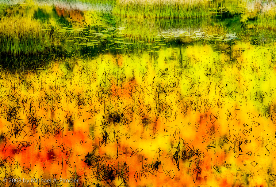
I looked at this for a while.........again.......can't put my finger on the exact why?.........but I do find myself liking this one as an abstract........almost Jackson Pollock painting. I did Selective color ,blacks, black slider 80%.....color adjust.....blues +20......finally local contrast adjustment of 20/50/0..........finally a slight crop from the top.......the more vibrant color and contrast in the twigs really emphasized the effect.......maybe an Orton effect would also work here. While I generally avoid twigs or other protrusions in the water.......their graphic element is what works for me best in this image.


 Reply With Quote