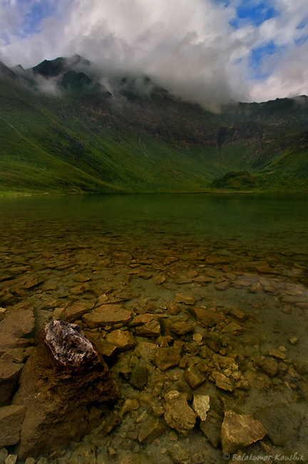
Made this image during a hike near south-east of Switzerland. The weather was overcast & cloudy most of the times. This was the one of the few images where a "bit" of sky was visible.
A really nice scene. I might give the foreground just a bit more pop. The composition really works for me though. Im curious on the use of f22 as it can cause diffraction and loss of sharpness. F13 probably could have a achieved enough dof at the wider focal length.
Hi Kaushik,
I am not a fan of the heavy frame as sometimes.......as in this case........it weighs the image down so I would not use one or have a very small one for presentation. That aside.......
I find the image a wee bit dark. A very slight levels adjustment and a bit of contrast may give the extra pop Paul and I are both looking for. Compositionally........this is very strong as the FG rocks lead me to the distant mountain and the clouds pull me back down and in. I also like the strong anchor point of the rock in the LL.
Looks like you can use a bit of sharpening on the rocks also. Minor PP adjustments to a nicely composed image.
Lovely image. The rocks nicely lead your eye into the image. I would prefer this image without the borders. The borders somehow appears restraining. Overall, I like the image.
I like this composition. It has hints of the "beautiful" images of mountains and lakes, but it's not overdone. There is enough subtlety and looseness that gives this a good energy. I guess it feels a little dark, but I don't think that hurts the image here. I'm not sure the big black frame is necessary with this presentation, but a black background works well with the image. I also don't think there's any need to crop away any sky, unless you want to force us to contemplate the connection between mountain and lake.
-matt
The composition works well for me for the reasons mentioned. The black border is problematic. Black borders make images look dark. Images with subtle shadow tonality will all but lose that subtleness with black border whereas a white border does the opposite. I was just reading an article the other day and saw some examples but cannot recall it now.
Overall it is too dark. A curves adjustment to open up the shadows and mid-tones plus a bit of highlight tweaking will enhancement the image in my estimation.
Thank you all for the feedback. I tried tweaking the image with shadow/highlight in PS & removed the border. Here's a result. Guess I should take more care while PP from next time... :)


 Reply With Quote