Hey Mike,
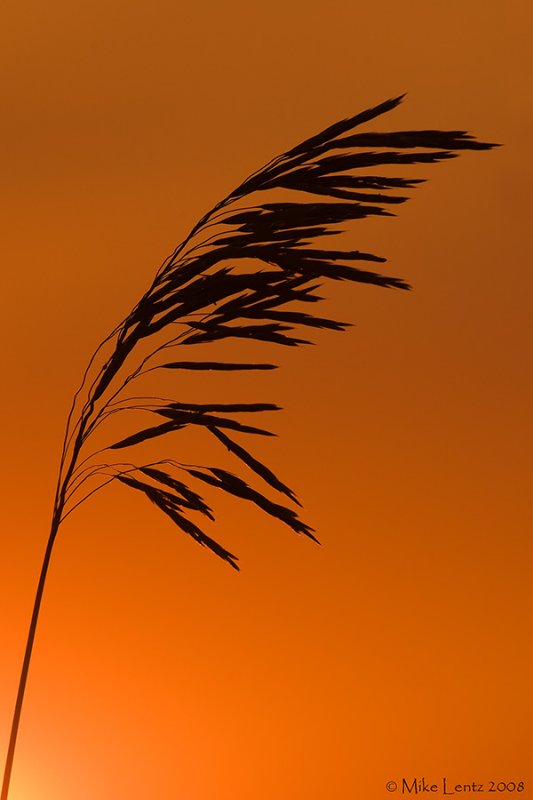
Love the simple yet elegant presentation. a bit more room on the stem to the left......but not enough of a distraction to take away from the overall image.
Lovely graphic image. You could probably extend the canvas to the left to give that stem some room. You may even be able to get a touch more saturation in the orange tones, but I already love it and the warm glow just off camera LL.
That's beautiful Mike. I agree on adding a bit of room to the left but really do like it even as presented. Is this sharpened because it does look to me like it could use a tad more.
I rather like the stem entering the frame at the llc... If you could have gotten a bit higher, maybe on a beach chair, you could have included more of that llc light... As is, the blacks could be blacker and the sky brighter and more saturated.
BIRDS AS ART Blog: great info and lessons, lots of images with our legendary BAA educational Captions; we will not sell you junk. 30+ years of long lens experience/e-mail with gear questions.
BIRDS AS ART Online Store: we will not sell you junk. 35 years of long lens experience. Please e-mail with gear questions.
Check out the new SONY e-Guide and videos that I did with Patrick Sparkman here. Ten percent discount for BPN members,


 Posting Permissions


 Reply With Quote