Results 1 to 8 of 8

Thread: Limpkin Portrait

  1. #1
    Ed Kelly
    Guest

    Default Limpkin Portrait


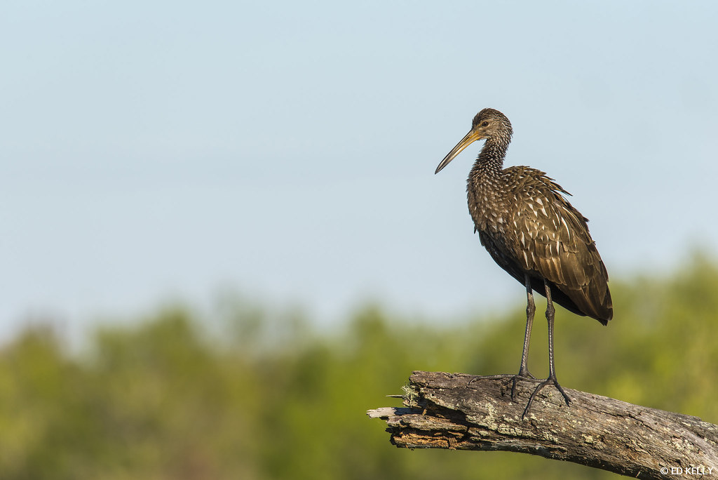
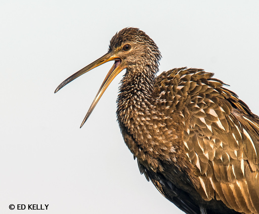
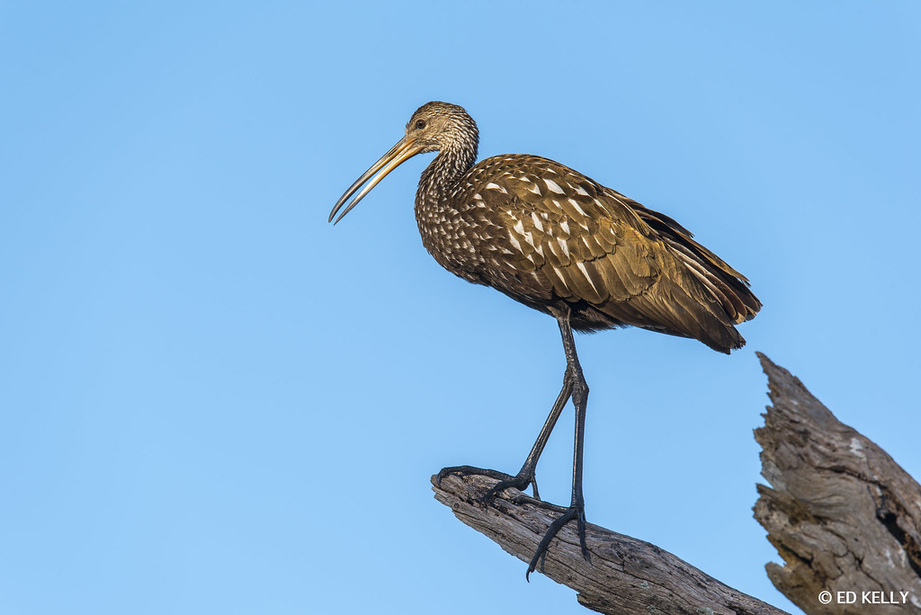
    Limpkin at Circle B Bar in late evening light. Had a few poses and two different trees.I had a hard time deciding what I liked best. Just a little LR and ran smart sharpen through CC. Thanks for looking.Tell me what you think.

    D750 & Tamron 150-600mm @ 460mm
    ISO 220
    F/9
    1/400 second.

    Ed

  2. #2
    Forum Participant
    Join Date
    Mar 2008
    Location
    Santa Rosa, CA
    Posts
    9,587
    Threads
    401
    Thank You Posts

    Default

    I love it, but I'd like to see a version with the heavy top part of the perch removed.

    The few times I've tried to photograph these, I've gotten ugly glare or reflections from the glossy feathers, Great lighting here!

  3. #3
    Ed Kelly
    Guest

    Default

    Quote Originally Posted by Diane Miller View Post
    I love it, but I'd like to see a version with the heavy top part of the perch removed.

    The few times I've tried to photograph these, I've gotten ugly glare or reflections from the glossy feathers, Great lighting here!
    Thanks Diane. That was my thought also. I had him looking over his shoulder towards the stump on the right,that seemed a little more balanced,but the light was just not the same. Maybe I should have just removed it. Here is the same Limpkin on the tree right next to the original tree.


  4. #4
    BPN Viewer
    Join Date
    Mar 2009
    Location
    Philippines
    Posts
    420
    Threads
    126
    Thank You Posts

    Default

    Such a popper. Great work Ed

  5. #5
    Super Moderator Daniel Cadieux's Avatar
    Join Date
    Jan 2008
    Location
    Ottawa, Canada
    Posts
    26,315
    Threads
    3,979
    Thank You Posts

    Default

    Ed, the second image is miles better than the first due to the better perch and for the much better head angle and BG. Well done on that one. The first has that big extra piece that Diane mentions plus the head is angling away.

  6. #6
    Forum Participant
    Join Date
    Mar 2008
    Location
    Santa Rosa, CA
    Posts
    9,587
    Threads
    401
    Thank You Posts

    Default

    The second is better as Daniel pointed out, but there is too much negative space (where nothing is happening) on the left. The color balance is better (the first had a blue cast) but both are just a bit dark for my preferences. We have so many wonderful tools these days for bringing up darker tones and reducing bright ones.

  7. #7
    Ed Kelly
    Guest

    Default

    Quote Originally Posted by Diane Miller View Post
    The second is better as Daniel pointed out, but there is too much negative space (where nothing is happening) on the left. The color balance is better (the first had a blue cast) but both are just a bit dark for my preferences. We have so many wonderful tools these days for bringing up darker tones and reducing bright ones.
    Thanks Daniel & Diane. On Flickr my images seem more lively. They tend to loose something with the conversion to Avian. Agree about the second spacing issue. That was the full frame.


  8. #8
    Forum Participant
    Join Date
    Mar 2008
    Location
    Santa Rosa, CA
    Posts
    9,587
    Threads
    401
    Thank You Posts

    Default

    If you're set up for correct color management and using a properly calibrated and profiled monitor, images here should look identical to those on your monitor. Nothing happens here to change their appearance. BUT things can and will happen in your browser, and I don't know how things like Flickr manage color.

    I pulled your images into PS and you have them in AdobeRGB. That won't make them darker, and the way I'm set up, the colors won't change from the actual values in the file. For some viewers that won't be the case.

    Check two tutorials in the Educational Resources forum about getting proper colors and posting on the web.

    The issue of them appearing a little dark to me could just be that we have different preferences. The last one is brighter and more to my liking. Very nice sharpness, too!

    Or your monitor could be too bright, which would be causing you to adjust images toward the dark side. There's a tutorial there on that, too.

Posting Permissions

  • You may not post new threads
  • You may not post replies
  • You may not post attachments
  • You may not edit your posts
  •  
Web Analytics