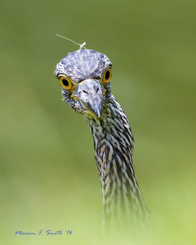
I've been lurking for a year or two, and finally decided to take the plunge. I moved ahead of this juvenile Yellow-crowned Night Heron and waited for it to come over the edge of the rise for this shot. It has been cropped from horizontal to vertical format and has some minor adjustments in Adobe Lightroom. The lower edge effect is simply out of focus grass between the heron and the camera. How would you crop this image? I know that usually I'd place it off center, but that just didn't seem to work with this image.
Canon 7D with 300 f2.8 and 2x extender on Gitzo tripod and Mongoose head.
1/640 f8 ISO 500
Marvin, welcome! I love this! What a great first post! The OOF grasses in the FG create a beautiful vignette and I don't think there is a better crop than what you did here, at least for my taste.
Two minor critiques are that there is a blue cast on the bird, most apparent on top of the head, and a fine sharpening halo around the stray feathers sticking up form the head. Both easily dealt with. The best sharpening methods for web presentation have been the subject of several threads here recently.
Your crop looks great to me. I think when the subject is looking directly at the camera that placing it in the center or close to it works well. I like the clean background and you did a great job with the details in the feathers. The "glowing" around the feathers sticking out of the head is fairly noticeable. Great first post!
Marvin, this is a really cool image, Vertical is the way to go here, my only very MINOR critique (beyond what others noted) would be to blend out the darker background "line" running approximately parallel to the subject. For me, it tries to pull the viewer's eye off of the subject. I might try cropping it a smidgeon off the top and left putting the thirds intersection at the front edge of the left eye. Again, a very minor adjustment to a gorgeous image.
I did a quick Shadows-Highlights to darken the top of the head slightly and used the gray eyedropper in Curves to neutralize the blue cast, which gave a major change to the BG color. (Both better done in RAW processing.) How far to go, especially with the colors, is hard to assess. The bird has some brown in the head feathers (more than I got here) but blue sky reflecting off them will give a natural cast. Just tossing this out to show a possibility. If the BG went too yellow that can be addressed in the HSL section of LR / ACR or Hue-Sat in PS.
Thanks everyone. Diane, I'm not sure what color the bird is supposed to be. Blue being my favorite color, I always like it with the blue head. I'm still trying to learn about post-processing. To correct the head plume halo, do I simply do less overall sharpening, or do I selectively do less sharpening on just the plumes? Eager to Learn!
One other quick question. I never pay attention to the location or color of my copyright signature. I'm guessing that the placement in this image is OK, but I probably should have done the signature color in dark green??
I assume the halo came from sharpening. I do sharpening on a separate layer and mask off areas that are overdone.
I think the signature is tastefully done and the color is fine -- in this case it matches the blues on the heron. I think it would be easy to tweak its color to fit an image.