
Originally Posted by
Diane Miller

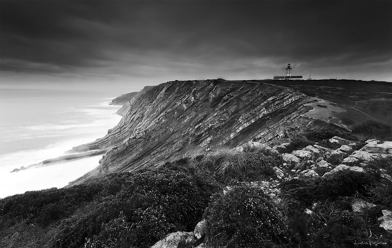
Interesting -- different and very nice! The sky is wonderful, but I would also like to see the left side darker, with more detail. There does seem to be some wide-angle distortion. The lighthouse and horizon, as David mentioned, but it looks like the roof is sloping the other way. Distortion of that sort is not that hard to correct. It might take a combination of the lens profile in LR (if one is available) and some work in the manual tab there. If that isn't enough, Edit > Transform > Distort or Warp in PS will finish it off.
I look forward to seeing more of your work!


 Reply With Quote